As I have recently left a consultancy (which started more than 8 years ago), I now have time to look back and reflect on both my career to date and the broader BI Industry. And by the way, the career is just getting started!
Perhaps the biggest benefit to “starting all over again” is that this time I am finally free to select the tools that fit the customer. Unless you are in a BI consulting firm you would find it hard to believe how much pressure there is to sell your companies selected tool, regardless of the custom fit. This was a lesson I learned the hard way and the results were not pretty, but that is a blog post for another week
This is a brief blog post about going back to the very origins of my BI career and the person who inspired it all, Mr. Charley Kyd and his ExcelUser.com website. Back in 2005 reporting was done old school style – on Excel 95. A sheet had 65,000 rows and only 256 columns. The tool kit of a reporting analyst was an array of Excel functions and perhaps some VBA scripting.
It was a time when there was no formalized BI Department and Excel was the king of Reporting. I was thirsty for knowledge and I was lucky to come across ExcelUser.com by Charley Kyd. I immediately signed up and purchased “Dashboard Reporting with Excel”. Despite using an array of BI Visualization tools over the last 15 years I still find myself referring to this book and similar publications by Mr. Kyd. If you look at his output you will immediately see an array of best-in-class executive reporting. The older the book gets, the more relevant it gets for me!
And how, or why is it still relevant and best in class, well let’s first look at some reports and then look at Mr. Kyd himself.
 On the left is one example of hundreds of Dashboard templates the website has. Despite the colors, it is incredible to see how much data actually resides in this sheet of paper. What impresses me is that I am very quickly drawn to bad performance and to sets of data that are not measuring to past performance.
These were made in the day when a Dashboard wasn’t a fancy touch-screen-based app. A dashboard wasn’t a mobile-optimized screen, but rather a Dashboard was a spreadsheet formatted to be printed on an A4 piece of paper. Yes, just one or two sheets of paper that much explain the whole story to key executives.
One of the secrets to the above are “mini-charts” and on his website, lots of effort is given to “mini-charts“. I quote verbatim…
“The most common mistake that Excel users make when they create charts is to make their charts too large. Large charts make it difficult for readers to absorb information at one glance. Small charts don’t have this problem. Large charts use up valuable space on a page. They force readers to flip back and forth between pages to compare results. Small charts let readers compare many measures of performance on a single page. For management reporting, don’t use charts; use mini-charts. Unfortunately, mini-charts take extra work to produce.“
Since the above was written about mini-charts, nothing has changed at all. Except that BI Tools of the modern age make mini-charting even harder (except Excel 🙂 ). Qlikview tried this with Trellis charting but it never managed to transform into the pixel-perfect reporting that makes management happy.
The website and book also have great examples of the lost art of “traffic lighting”.
It is in my opinion that this is a lost art because modern BI tools simply don’t present a comprehensive “traffic lighting” solution.
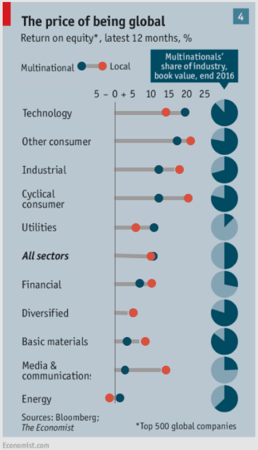
The above are just two examples of what I call the “lost art of reporting”. Sadly, many BI consultants and developers haven’t worked in a corporate reporting environment where they get to understand how management thinks and wants to see their data. As Mr. Kyd implies, most senior managers and executives are hungry consumers of financial publications like the Economist, Forbes, Wall Street Journal, etc. And this is where the best and most well-presented data charts and infographics are found. A graphic designer for a website or the Economist for example is ever more hard-pressed to make information intuitive to read and to bring data to life with trends, exceptions, comparisons and traffic lights, etc.
And so the summation of this blog post is that to go back to grassroots reporting and analysis, don’t look to the latest version of your BI tool, pick up either an old or a new copy of the Economist, Wall Street Journal or Financial Times – you might find what you see very refreshing indeed!
Written by Hamish Imrie – Founder at DataActive Consulting