
Intro to Paginated Reports.
Power BI is a fantastic data visualisation tool. Providing many colourful and visually appealing graphs, charts, and tables aimed at helping you tell the story of your data.
Power BI is perfect for interactive reports. Not so much for print. Enter Paginated Reports. Power BI Report Builder allows users to build pixel-perfect reports suited for print. You have more control over the visuals and are able to customise the page to your liking.
What about the data? You are able to use Power BI desktop to transform and manage your data. Once you’re done with the data you publish the dataset to the Power BI service and connect to it from the Report Builder
Our Project Scope.
We were approached by our client who requested to have their reports emailed monthly to them in PowerPoint format. We were provided a 20-page template. Each page dealt with a certain aspect of their sales and volume market share as well as their competitor’s market shares.
At this point, you’re probably wondering; “Why not just use the Power BI Desktop?”. The problem with that is sizing. Certain aspects of the report could potentially “spillover” to the next page.
Another issue is cost. The only way to automate the sending of the Power BI desktop reports is with Power Automate. An additional cost our client was not willing to pay.
With this in mind, we had come to the conclusion that Power BI desktop would handle the data transformation and the Report Builder would handle the reports.
Page sizing.
Firstly, paginated reports have no pages per se. You have one long blank canvas that can continue for as long as you need it. Great for a single visual like a table that repeats for thousands of rows but not so much for multiple pages with differing visuals.
So we had to find a way of creating separate pages on this canvas. We decided on using white rectangles as pages. The report was supposed to be landscape orientated. This meant the rectangles were sized at 327.82mm x 180.5mm. Each rectangle had to have the “Add a Page Break after” option selected. This ensured that the blocks behaved like pages. We numbered the rectangles for easier identification. Great! 20 pages prepped and ready.
Data Modelling.
The report was very large and had many visuals (sometimes up to six charts per page!). We initially tried building the report with one dataset. The way data is brought into the visuals in the Report Builder is with the DAX SUMMARIZECOLUMNS function. You write the DAX function which produces the results you need and then place these values in your visuals. Suffice to say this did not work. The values were wrong, the report was slow and very difficult to maintain.
We then set about rebuilding the whole report. This time we created a dataset per visual. This ensured that there was very little room for error and the values started making sense. Because we named the datasets after the visuals and the page they were on, maintenance was much much easier. Surprisingly this also made the report perform better. We had fewer timeouts and the output was generated in a reasonable time.
Datasets and visuals.
Let’s talk about visuals. The report had a vast collection of tables, line charts, bar charts, column charts, waterfall charts, and more. We’ll briefly go over a few interesting points later but this is mostly straightforward.
You can create the visuals with the wizard or do it manually. I would recommend using the wizard for tables/matrixes and doing charts manually. We found the charts easier to do manually but this is just our experience. Your mileage may vary.
We populated our report as the client required and stumbled across a few interesting issues…
Expanding visuals and spacing.
One of the main selling points of the Report Builder is its ability to display all the data in a table when exported to PDF or PowerPoint. Something Power BI desktop can’t do.
So the visuals expand as they are populated. Now, remember those white rectangles we used to create our pages? The space between the edge of the rectangle and the table/chart would remain constant. See this image below:
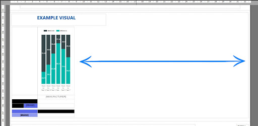
The example above contains a tablix with a bar graph in its top row and other calculations in the rows below that. The column is grouped on Manufacturer and will repeat for each Manufacturer in the dataset. The Manufacturers are filtered in the dataset and will only display 5 in total.
Now if you pay attention to the blue arrows you will notice a substantial amount of white space between the edge of the rectangle (edge of our “page”) and the tablix. This white space will be added to the back end of your completed matrix once the report is run. Now, remember that the rectangle adds a page break to the end of it. The result of this is an additional blank page in your report.
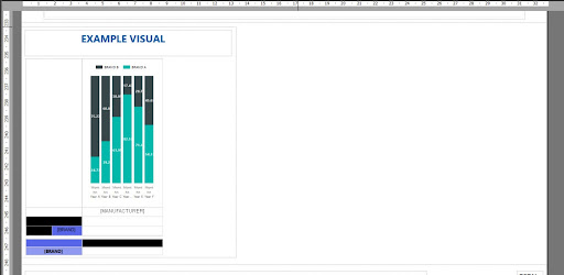
The way to fix this is to simply reduce the size of the width of the rectangle as close to the visuals as possible. See the image below:
Waterfall Charts with custom start and stop values.
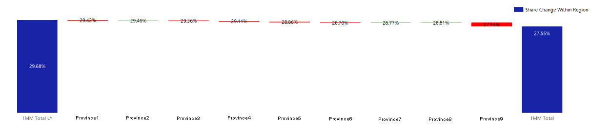
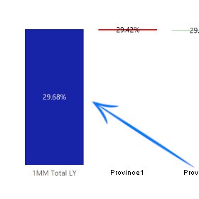
With the sizing issue sorted we moved on to creating the waterfall charts. The clients wanted waterfall charts of the % share of products and the change between provinces. This was perhaps the hardest part of the project. The waterfall charts needed to start at the share of the same period this year, show the changes for the provinces, and then equate to the latest periods share. See the image below:
Now credit where credit is due. I used this article to start me off: https://www.oraylis.de/blog/2014/improved-waterfall-chart-with-ssrs
This only got me halfway and after weeks of tinkering, I managed to get the result the client wanted. Here is a step by step instruction to creating this awesome waterfall chart:
Step 1 – Creating the Dataset
In Power BI Desktop you will want to create a table using SUMMARIZECOLUMNS where you aggregate, in our case, the Manufacturer, Region/Province, Latest Period Sales, and Latest Periods Sales Last Year. Latest Period Sales and Latest Periods Sales Last Year are measures I have already created for the rest of the report. Let’s call this table WATERFALLTABLE.
Step 2 – Creating the Measures
Create your share and share change calculations. The measure I used was:
Latest Period Share =
DIVIDE(
SUM(‘ WATERFALLTABLE’[Latest Period Sales]),
CALCULATE(SUM(‘ WATERFALLTABLE’[Latest Period Sales]),
ALL(‘WATERFALLTABLE’)
)
)
I did the same for Latest Periods Sales Last Year.
For the change measure, I just subtracted the top two measures from each other. We should now have 3 measures:
- Latest Period Share
- Latest Period Last Year Share
- Share Change
After you’ve created his dataset it’s time to import it into the Report Builder. There are a few things to keep in mind. The waterfall chart has the text “1MM Total LY” and “1MM Total” in the region column and there is a custom sort to the region column. You will need to UNION these additions into your dataset in the Report Builder. Here is the code for my Dataset:
UNION(
UNION(
SUMMARIZECOLUMNS(
‘WATERFALLTABLE'[MANUFACTURER],
‘WATERFALLTABLE'[REGION],
“Value 1MM LY Change”, [Share Change],
“Value 1MM Total”, 0,
“Sort Index”, 2
),
ROW(
“MANUFACTURER”, “”,
“REGION”, “1MM Total”,
“Value 1MM LY Change”,0,
“Value 1MM Total”, [Latest Period Share],
“Sort Index”, 3
)
),
ROW(
“MANUFACTURER”, “”,
“REGION”, “1MM Total LY”,
“Value 1MM LY Change”, [Latest Period Last Year Share],
“Value 1MM Total”, 0,
“Sort Index”, 1
)
)
Now how the UNION Inserts “1MM Total LY” in the REGION and inserts the Latest Period Last Year Share into the “Value 1MM LY Change”. This gives us this result:
This is the final dataset we will use for the waterfall chart.
Time to handle the visual!
Insert a range chart in your report as you would normally. Drag in REGION as your category group. Add the change as the first measure. As mentioned in the linked article you will need to use RunningValue. Here are the High and Low calculations I used:
HIGH
=RunningValue(Fields!ID_Value_1MM_LY_Change_.Value, Sum, Nothing)
LOW
=RunningValue(Fields!ID_Value_1MM_LY_Change_.Value, Sum, Nothing) – Sum(Fields!ID_Value_1MM_LY_Change_.Value)
To get the end value column You will need to add the “1MM Total” Measure. Once added you will need to change the chart type (for that measure only!) to a normal column chart. In the properties pane on the right under CustomAttributes ensure that DrawSideBySide is set equal to False (again only for this measure!).
Make sure the REGION group is sorted by Sort Index and you are set! You’ve now created a % share waterfall chart with custom start and stop values.
Conditional Fonts and Bars
Let’s make these visuals stand out. Power BI desktop makes conditional formatting easy. The Report Builder on the other hand took some getting used to.
Once we got the hang of making column values green or red based on their value. We started getting clever with the formatting.
When you enable the data labels on the waterfall charts we created you will notice that there are now two sets of data labels. That’s because we have two measures in the visual. This is a simple fix with the visibility option. Change the value to:
=IIF(Fields!REGION.Value = “1MM Total”, True, False)
That will hide all the 0 values for the “1MM Total”.
What about the bars? How can we change the colour of the bars based on their values? Well in our case we didn’t need the colours for the start and end values to change. So we just made them one shade of blue. The REGION changes needed to change. We used the following code to do that:
=IIF(Fields!REGION.Value = “1MM Total LY”, “#1724a8”, IIF(Fields!ID_Value_1MM_LY_Change_.Value < 0, “Red”, “Green”))
The “1MM Total” column was also just set to be one standard shade of blue.
You can apply the same techniques to your other visuals, data labels, text properties etc!
Utilising Power BI to assist you
During the process of doing this project, we noticed that a substantial amount of time was lost due to waiting for the Paginated Reports to run and produce the output so we could see the end result. We kept going back to Power BI to produce the numerical output and then just import that into the Report Builder. These two Programs should always be utilised with each other and not just as a means of getting data from the service to the report builder.
Our Findings when Building a Multi-Page Report
We stumbled across a few bugs and shortcomings during this project so we decided to create a list of tips and tricks to help you on your journey.
Tips for working with the Report Builder
Copying Visuals with the RunningValue calculation causes it to break.
We noticed that copying a waterfall chart with the RunningValue calculation causes the function to drop its second parameter eg:
Before copy
=RunningValue(Fields!ID_Value_1MM_LY_Change_.Value, Sum, Nothing)
After copy
=RunningValue(Fields!ID_Value_1MM_LY_Change_.Value, , Nothing)
The ‘Sum’ drops from the function. We haven’t found a reason or solution to this so just keep this in mind!
Layer Order is Very Important.
If you use the white rectangle method to create pages and find yourself clicking on your visuals and nothing happens. Chances are the layer order is wrong. Right-Click on your visual, select “Layout” and select “Bring to front”.
Exporting your report to PDF is sometimes more accurate than the report preview.
If you find your report dropping text, moving visuals around or it just doesn’t look right try exporting. Sometimes that result will be more like the one you had in mind.
Conclusion
Power BI Report Builder is a wonderful tool, perfectly suited for its intended role as a Pixel Perfect Report Builder. Admittedly what we tried to achieve with this program was a bit out of its depth but it is possible. We will be doing a video tutorial depicting these steps in the near future.